
Data analysis
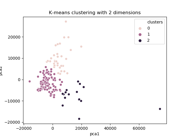
The K-Means method was applied in order to obtain groupings of cities based on the variables presented. As the number of variables in the database is above 2, PCA (Principal Component Analysis) was used to reduce the dimensions to just 2. With this, it was possible to graphically analyze the choice of K value for K-Means.
Code
The following libraries were used:
- sklearn: build the model using K-Means algorithm;
- matplotlib: plotting graphs (boxplot);
- pandas: DataFrame for store data from csv and fast manipulation;
- seaborn: plotting graphs (clusters).
Importing de libraries necessary…
from sklearn.cluster import KMeans
from sklearn.decomposition import PCA
from matplotlib import pyplot as plt
import pandas as pd
import seaborn as sns
Loading data to DataFrame….
dataframe = pd.read_csv("data/cost-of-living-transpose.csv")
Building a model…
- Selection of features
features = list(dataframe.columns)[1:] features_data = dataframe[features] - Create a model
model = KMeans(n_clusters = 3, init='k-means++', max_iter= 300, n_init = 10, random_state = 0) - Train model with data, predict cluster index for each city and store on DataFrame on column called clusters
dataframe["clusters"] = model.fit_predict(features_data) - Save result on csv
dataframe.to_csv("data/result.csv")
Viewing clusters
- Reduce dimensionality using PCA
reduced_data = PCA(n_components=2).fit_transform(features_data)
results = pd.DataFrame(reduced_data, columns=["pca1","pca2"])
- Using scatter plot
sns.scatterplot(x="pca1", y="pca2", hue=dataframe["clusters"], data=results)

plt.title("K-means clustering with 2 dimensions")
plt.show()
Boxplot
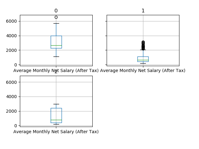
Initially, a set of three boxplots per variable was analyzed, each boxplot being related to a cluster.
These graphs can indicate the location of the median and the variation in each cluster. It can also indicate outliers, which can have a significant impact on the interpretation of the clusters.
The code below shows how the boxplot was generated…
group_by_clusters = dataframe.groupby("clusters")
average = group_by_clusters.mean()
std = group_by_clusters.std()

for feature in features:
    print(feature)
    print(average[feature])
    print(std[feature])
    group_by_clusters.boxplot(column = feature)
    plt.show()
For example, in the “Average monthly net salary” variable, cluster 0 has the highest cost, cluster 1 having the lowest cost and cluster 2 has an intermediate cost and with the greatest variation.
In the variable below, cluster 0 has the highest cost, clusters 1 and 2 have very similar costs. Of them, only cluster 0 has the greatest variation.
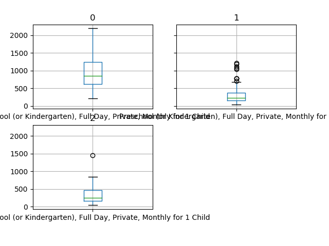
The other boxplots follow similar trends. In general, cluster 0 has the highest cost, cluster 1 has the lowest cost and cluster 2 has the intermediate cost with the greatest variation.
Hypothesis testing
Initially, in each variable, an ordering of the clusters was made based on the average of each in each variable. For example, considering variable X, if cluster 2 has a higher average, it will come first than the other clusters.
With ordered clusters, we can already assess which has the highest cost of living and which has the lowest cost of living. However, another question arises: are the averages of each cluster significantly different from each other?
The hypothesis test chosen was a non-parametric one called Mann-Whitney. In addition to our base being reduced, each cluster does not have the same size, so a non-parametric method was more appropriate.
The hypothesis test tested the difference in means between the highest average cluster versus the intermediate average cluster, and then the intermediate average and the lowest average cluster. Thus, we can compare the results of the boxplot more safely.
- H0: the average between two groupings are equal
- H1: the averages are different
-
alpha = 0.05
- Procedure:
- Ordering of clusters based on average
- Testing the first cluster with the second
- Testing the second cluster with the third
For example, for “Meal for 2 People, Mid-range Restaurant, Three-course” and “McMeal at McDonalds (or Equivalent Combo Meal)”.
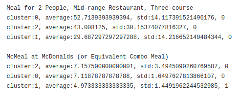
The clusters are presented in the order of average, and show the average, standard deviation and a mark (0, 1 or 2), to indicate whether it is the same or different from the next cluster. For the first variable presented above, there is no significant difference between the three clusters. In the second variable, there is no significant difference between the cluster 2 and 0, but there is a significant difference between the cluster 0 and 1.
Most variables had the same pattern presented in the analysis of boxplots. Some showed that there was no significant difference.
Result and Discussions
Groups can be characterized as shown below:
- Cluster 0:
- Higher cost of living with little price variation;
- Some more affordable luxury items;
- 33 cities in this group.
- Cluster 1:
- Lower cost of living with little price variation;
- There are cases of prices above average (outliers);
- 111 cities in this group.
- Cluster 2:
- Cost uncertainty;
- Ideal for any consumption profile;
- 16 cities in this group.
It can be concluded that the objective of the present work was achieved, managing to characterize the three groups in a satisfactory way.
Github repository
The link for github repository for this anlysis is https://github.com/moabson/cost-of-living-analysis.