Data visualization
After downloading the dataset, it would be interesting to view the data first. In this case our dataset is in .csv format, how is he not so big, for a quick view we will use LibreOffice Calc, it is free and has open source.
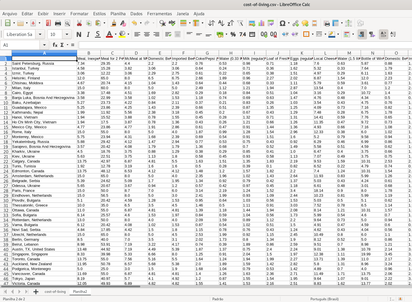
Opening this file, we can quickly see the “face” of our data.
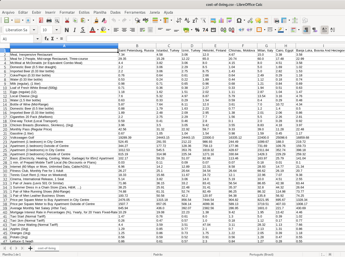
As we can see, for example, on line 13, the price of a Water (1.5 liter bottle) that varies according to the city, as well as Internet (60 Mbps or More, Unlimited Data, Cable / ADSL) on line 29. With that we may ask: which cities have the highest / lowest cost of living based on the price of the items listed?
Data manipulation
As previously mentioned we will invert the data in such a way that the lines represent the cities and the columns the items. We will do this using LibreOffice Calc.
- select all data
- copy selected data
- create new worksheet and click on A1 cell
- paste using the shortcut ctrl + shift + v
- click on checkbox option “Transpose” and press button “OK”
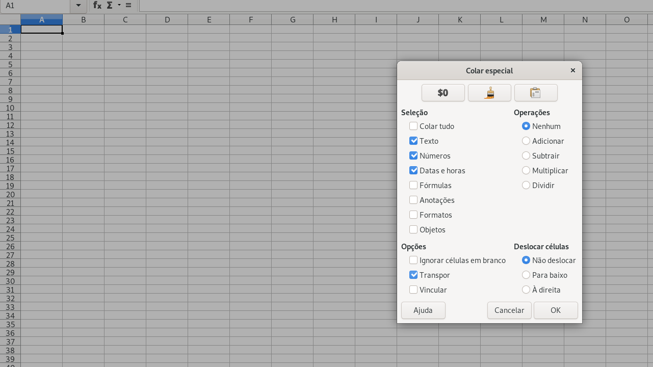
Now we have the data as we wanted it…